• Skip to main content
  • Skip to footer

User Experience UX/UI Designer

Jeg skaper brukeropplevelser

  • Home
  • About
  • Skills
  • Blog
  • UX CASE STUDY
  • Android Apps
    • Rock, Paper, and Scissors Game
    • Classic Tic Tac Toe Game
  • Privacy Policy
    • Privacy Policy RockPaperScissors App
    • Privacy Policy Tic Tac Toe Game
  • Contact

UXfordeg

Mar 15 2024

Programs for User Testing:

Choosing the best program for user testing depends on your specific needs, including the type of product you’re testing, the stage of development, and the kind of feedback you’re seeking. Here’s a list of popular user testing tools, each with its unique strengths:

  1. UserTesting: This platform allows you to get real-time feedback from users around the world. It’s particularly useful for gaining insights into how people interact with your product and why they make certain decisions.
  2. Lookback: Lookback provides a robust platform for live interviews and usability testing with real users. It allows you to observe users interacting with your product in real time, offering both live and recorded sessions.
  3. Optimal Workshop: This suite of tools is great for various user testing methods, including card sorting, tree testing, and first-click testing. It’s particularly useful for information architecture and understanding how users navigate and find information in your product.
  4. Hotjar: Hotjar offers heatmaps, session recordings, and surveys, providing a visual way to understand user behavior on your website. It’s excellent for spotting issues users might encounter but might not articulate in a test.
  5. Crazy Egg: Similar to Hotjar, Crazy Egg provides heatmaps, scroll maps, and other visual tools to understand how users interact with your website. It helps identify what areas of your site draw the most attention and where users drop off.
  6. UsabilityHub: This platform offers a variety of tests, including preference tests, five-second tests, and navigation tests, helping you gather quick feedback on design decisions.
  7. Maze: Maze is a rapid testing platform that allows you to test prototypes, measure usability, and gather user insights. It integrates with design tools like Figma and Sketch, making it a seamless option for designers.
  8. Validately: Validately offers a range of testing options, from simple surveys to more complex remote user testing. It’s designed to be easy to set up and use, even for those new to user testing.

When choosing a user testing tool, consider factors like your budget, the size and demographics of your user base, the type of data you need (qualitative vs. quantitative), and how the tool will integrate with your existing workflow and tools. It’s often helpful to start with a trial or a demo to ensure the tool meets your specific requirements.

Maze testing program logo

Written by UXfordeg · Categorized: Usability Testing

Mar 15 2024

Double Diamond explained.


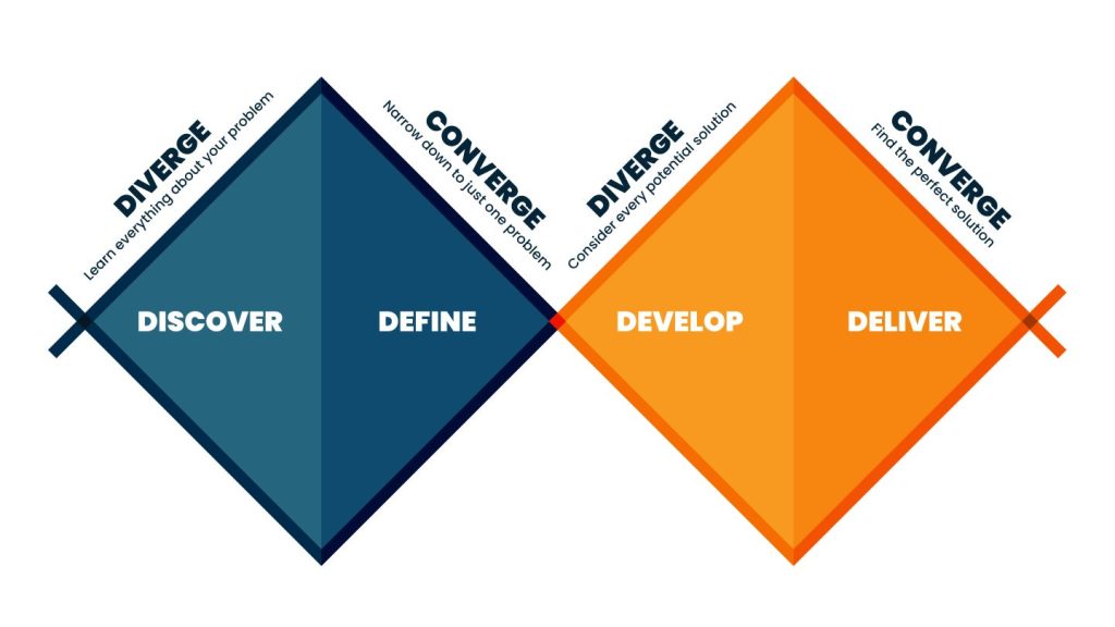
The UX Double Diamond is a widely recognized design process model that visualizes the approach to tackling design problems. Developed by the British Design Council in 2005, this model is divided into four distinct phases—Discover, Define, Develop, and Deliver—organized into two main diamonds that represent the process of exploring an issue more broadly and then taking focused action.

  1. Discover (First Diamond: Diverge): This initial phase is all about understanding the problem that needs to be solved. Designers conduct research to gather insights and understand the needs, behaviors, and motivations of users. This stage is characterized by open-mindedness and exploration, with the goal of gathering a broad range of information and perspectives. Techniques such as user interviews, observations, and surveys are commonly used to collect data and empathize with the users.
  2. Define (First Diamond: Converge): After exploring various aspects of the problem, the next step is to synthesize the gathered information and define the core issues to address. This phase narrows down the focus to specific user needs and problems identified during the Discover phase. Defining the problem clearly and concisely helps set a clear direction for the design process. It often involves creating user personas, user journey maps, and problem statements to focus the design efforts effectively.
  3. Develop (Second Diamond: Diverge): With a well-defined problem in hand, designers begin to generate a wide range of ideas and potential solutions. This phase encourages creativity and ideation, exploring as many possibilities as possible without immediate constraints. Techniques like brainstorming, sketching, and prototyping are employed to develop and visualize solutions. The goal is to explore a broad spectrum of ideas before narrowing down to the most viable ones.
  4. Deliver (Second Diamond: Converge): In the final phase, the focus shifts to refining, testing, and implementing the best solutions identified during the Develop phase. Designers create detailed designs, conduct user testing to gather feedback, and iterate on their solutions to improve them. The deliver phase culminates in the final product or service that addresses the user needs and problems identified earlier in the process.

The Double Diamond model emphasizes the importance of both divergent and convergent thinking at different stages of the design process, ensuring that designers fully explore the problem space and potential solutions before converging on a final design. It provides a structured yet flexible approach to problem-solving, encouraging thorough research, creative exploration, focused problem definition, and user-centered solution development.

Design thinking process
Double diamond process

Written by UXfordeg · Categorized: Design Thinking

Mar 07 2024

Atomic Design

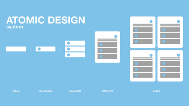
Atomic design description

What is Atomic Design?

“Atomic Design is not a linear process, but rather a mental model to help us think of our user interfaces as both a cohesive whole and a collection of parts at the same time.” – Brad Frost

Atomic Design is methodology for creating scalable systems, reusable components as well as design systems. There are five distinct levels in Atomic Design: Atoms, Molecules, Organisms, Templates and Pages.

Brad Frost’s Atomic Design approach starts with the smallest of parts: the atom. In a design context, an atom refers to the most elementary aspects of a design, for example, the HTML tags. These HTML tags make up details in a user interface – this includes commonly used icons or UI elements like checkboxes, toggles and radio buttons. Atoms become tangible once they are grouped together to form what are known as molecules. Molecules have a more understandable purpose as well as some form of functionality. A good example of what would be a molecule is a search bar with a button.

When built further and joined, these molecule components form organisms. Using the example of the search bar molecule, when you join a header or navigation bar at the top of the page design, it forms a larger component known as an organism. The organism is made up of atoms and molecules to form the building blocks of a layout. As you have learnt, consistency is key on the entire website or application, and to ensure this, the organism can be reused across the design.

When you group together multiple organisms, according to Brad Frost’s Atomic Design, you create templates. Illustrating the layout and relationship between the various organisms and their hierarchy is what is considered to be the template. A series of templates create a page, or in the case of a mobile application, a view.

Written by UXfordeg · Categorized: Interaction Design, Interaction design principles, Work

Mar 07 2024

12 Principles of UI/UX Animation

UX/Ui animations

The 12 UI/UX animation principles are guidelines that help designers create more intuitive and user-friendly interfaces using animated effects. These principles are derived from traditional animation but have been adapted to the digital context to improve interaction design. Here’s a brief overview of each:

  1. Timing: Animation timing makes interactions feel natural and responsive. Proper timing can make animations smooth and coherent with the user’s expectations, enhancing the overall user experience.
  2. Easing: Easing refers to the acceleration or deceleration of an animation, making it more natural. Linear animations can feel mechanical, whereas easing makes movements more organic, mimicking the physics of the real world.
  3. Anticipation: This principle involves designing animations that prepare users for what will happen, making the interface intuitive and predictable. It helps users understand how to interact with the UI effectively.
  4. Feedback: Animation should provide immediate feedback in response to user interactions, confirming that an action has been recognized and is being processed, enhancing user satisfaction and engagement.
  5. Hierarchy: Animated elements can establish a visual hierarchy, guiding the user’s focus to the most essential elements. Animation can highlight changes or draw attention where it’s needed.
  6. Consistency: Consistency in animation ensures that similar interactions produce predictable animations, making the UI more intuitive and learnable. This consistency helps users build a mental model of how the interface works.
  7. Performance: Animations should be optimized for performance to prevent delays or choppiness, which can detract from the user experience. Efficient animations enhance the perception of a responsive and seamless interface.
  8. Simplicity: Keeping animations simple and purposeful avoids overwhelming users with unnecessary complexity. Simple animations can effectively guide users without causing distractions.
  9. Scalability: Animation design should be scalable, ensuring it works across multiple devices and screen sizes without losing effectiveness or becoming a distraction.
  10. Purpose: Every animation should have a clear purpose, whether it’s guiding users, providing feedback, or enhancing the interface’s aesthetic appeal. Purposeless animations can confuse users or slow down interactions.
  11. Attention: Animations should be designed to direct user attention appropriately, helping users navigate the interface and focus on tasks without becoming a source of distraction.
  12. Context: Animations should be appropriate to the interface’s context, matching the application’s or website’s style and tone. The context helps determine how subtle or pronounced animations should be to fit the overall user experience.

By adhering to these principles, UI/UX designers can create animations that enhance the aesthetic appeal of an interface and improve its functionality and usability, ultimately leading to a more engaging and intuitive user experience.

Written by UXfordeg · Categorized: UI(UX Animation

Feb 23 2024

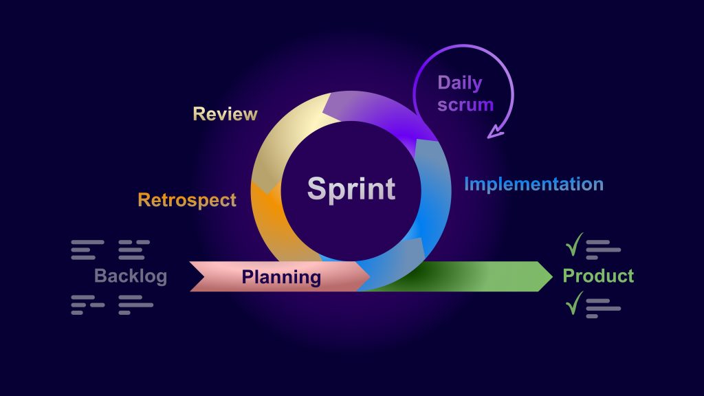
Work in this methodology:

Work Sprint/Scrum

Written by UXfordeg · Categorized: Scrum, Work

  • « Go to Previous Page
  • Page 1
  • Page 2
  • Page 3
  • Page 4
  • Page 5
  • Page 6
  • Go to Next Page »

Footer

Social Media

Follow by Email
Facebook
Facebook
fb-share-icon
Twitter
Visit Us
Follow Me
Post on X
LinkedIn
LinkedIn
Share
  • Home
  • About
  • Skills
  • Blog
  • UX CASE STUDY
  • Android Apps
  • Privacy Policy
  • Contact

Copyright © 2025 · Altitude Pro on Genesis Framework · WordPress · Log in